
Imagine you're looking through your favorite trendy magazine, and what catches your eye right away? Of course, the titles and headlines! In order to pique your interest and establish the mood for what's within, typography is crucial. So how do you pick the ideal typeface that exudes cool, sophistication, and style? This post will walk you through the process of choosing typefaces that will give your headlines and titles a fresh, modern feel.
- Know Your Brand's Character
Learn about the characteristics of your brand before choosing fonts. Are you sleek and contemporary, eccentric and enjoyable, or timeless and classic? This identity should be reflected in your font.
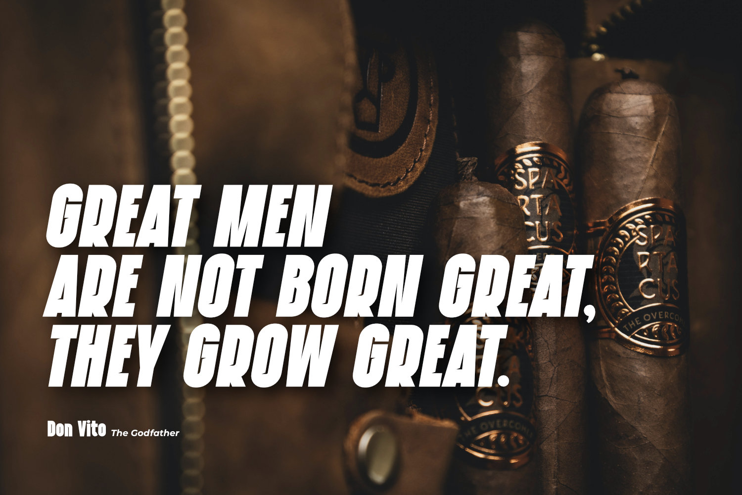
- Play with Serifs
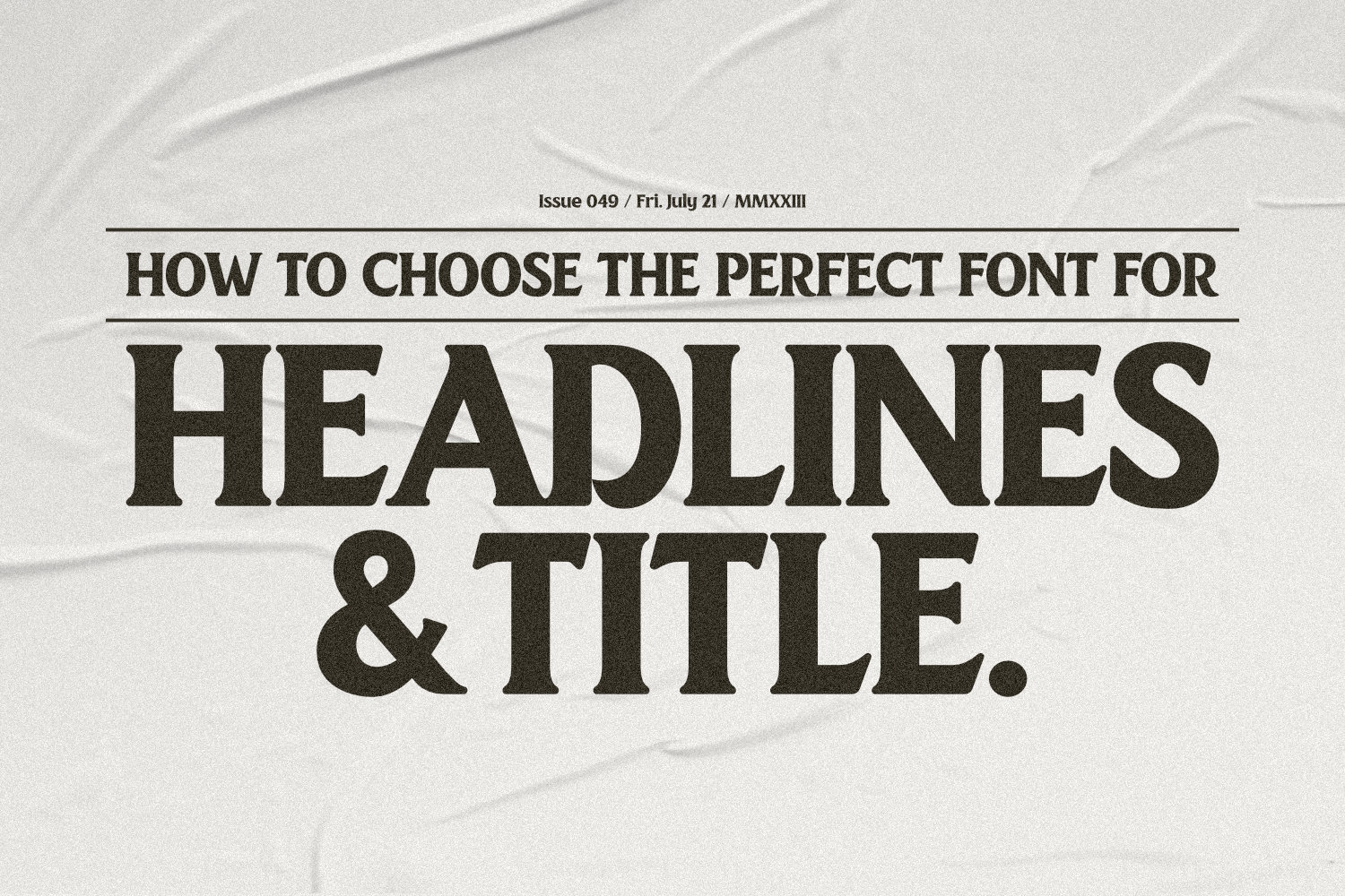
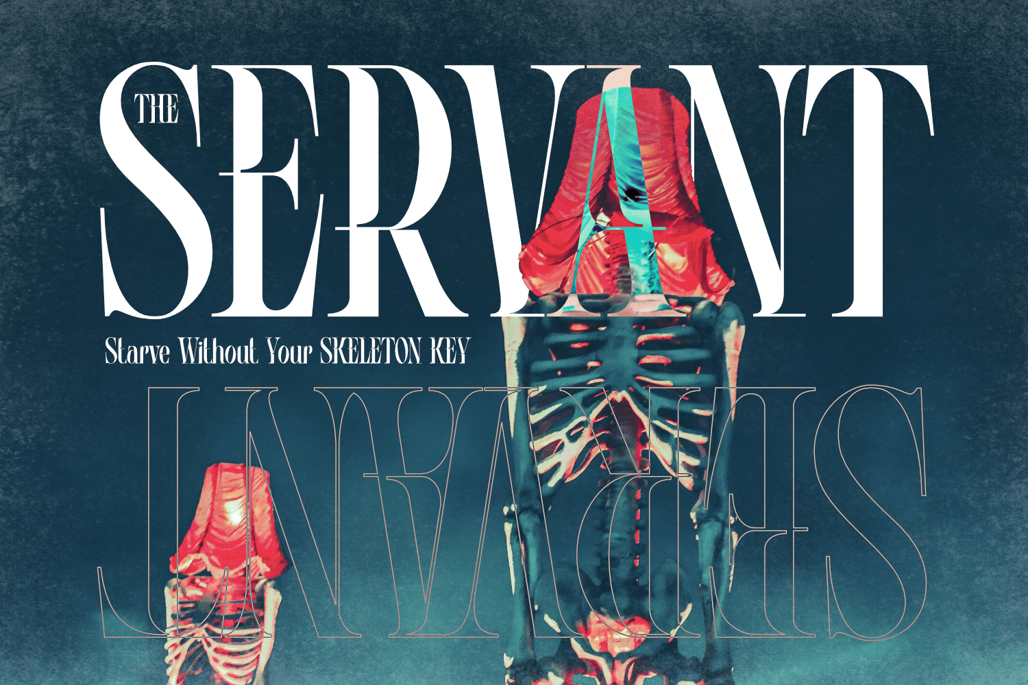
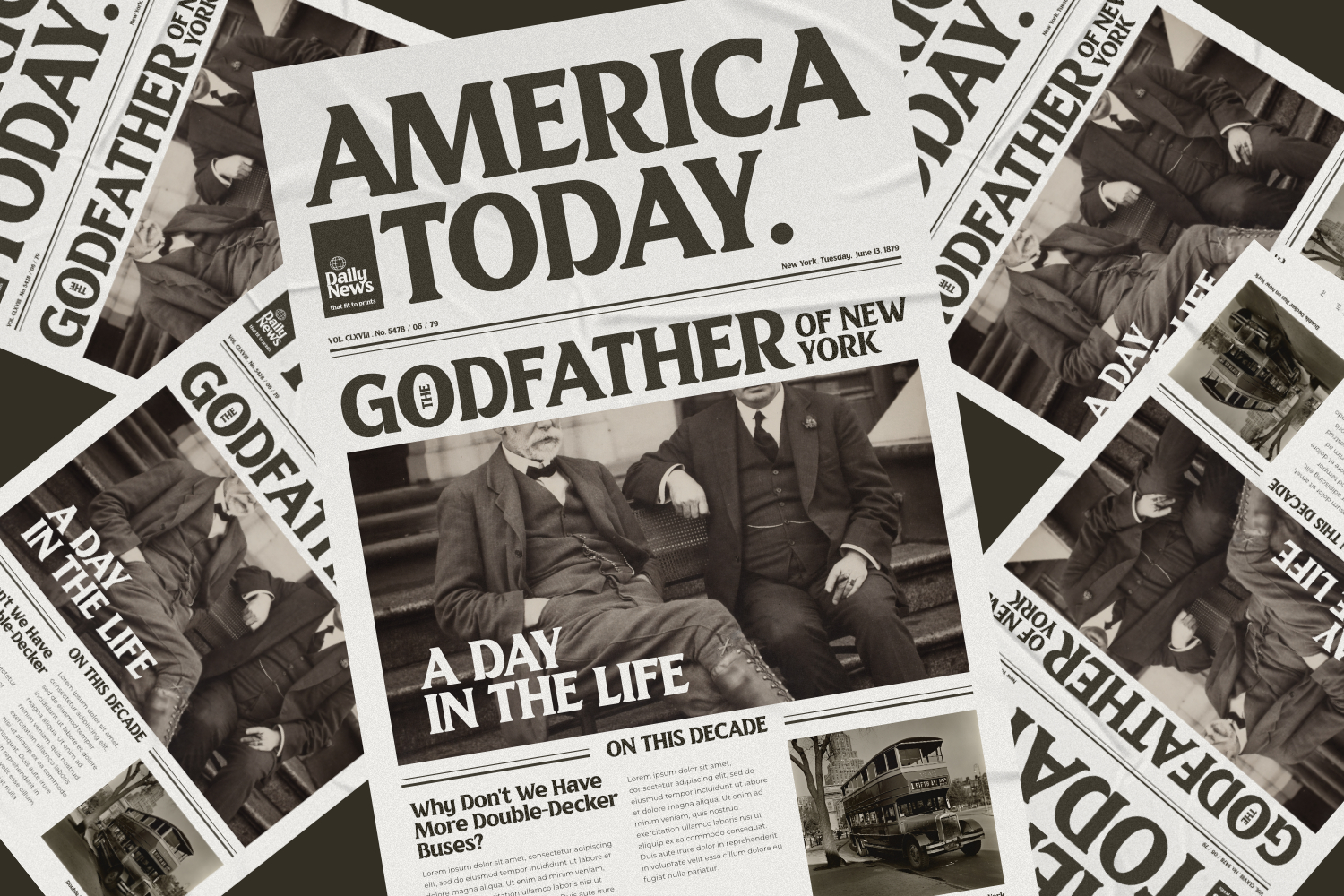
Serif fonts can give your headlines elegance because of their tiny ornamental strokes. The timeless elegance of fonts like Didot or Playfair Display is ideal for fashion and lifestyle magazines. Sans-serif typefaces can be used to counteract them and add a modern, youthful feel.
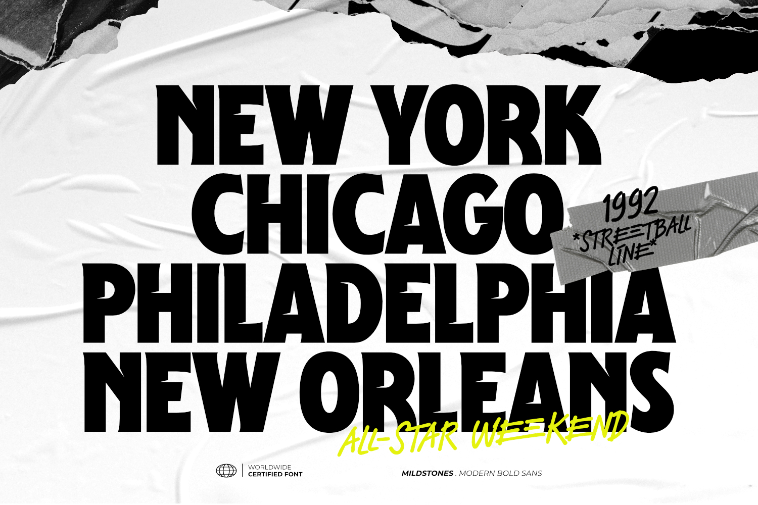
- Size Matters
Choose font sizes carefully. Larger fonts draw the eye, but don't use them excessively. Play around with font hierarchy and size to provide visual interest. To produce a dynamic layout that is both fashionable and reader-friendly, try combining a bold font for the headline with a more subdued one for the subheadings.
- Spacing and Kerning
Don't overlook the need for spacing! To make your fonts look professional and readable, adjust the leading and kerning of the lines. While generous leading provides an airy, youthful feeling, tighter kerning can give off a sophisticated, streamlined impression.
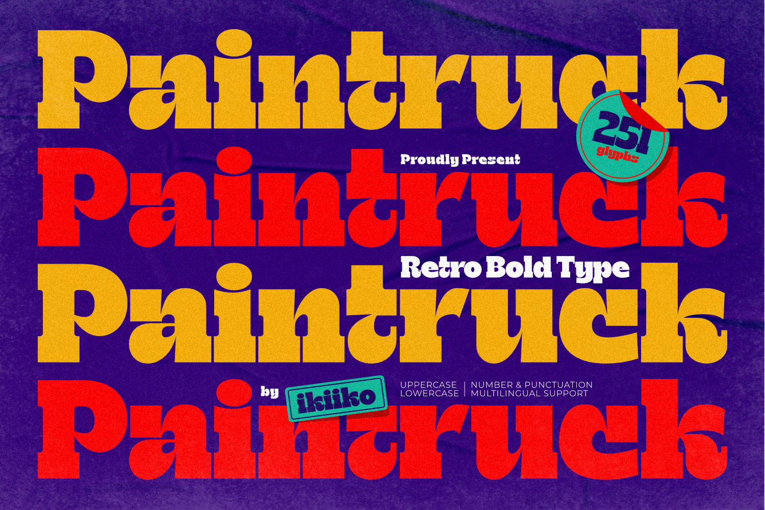
- Color and Contrast
Your typeface comes to life with color. Try out some vibrant, attention-grabbing colors for your headlines. To ensure legibility, check that the typeface and background have a sufficient amount of contrast. A sophisticated color scheme can take your design to the next level.
Conclusion
Typography is more than simply letters; it's also about creating an atmosphere and expressing a point. You can't ignore the art of selecting the ideal font for your headers and titles. Your font choice represents your voice in the world of design, whether you're striving for a clean, contemporary appearance or a fun, young attitude.
So keep typography's impact in mind the next time you're creating headlines for your stylish magazine. Try different font combinations until you find one that appeals to both your audience and your brand. Your headlines will stand out with the proper font, enticing viewers to explore the stylish content you have to offer. Keep it stylish and current, and allow your font do the talking.